North America
1. Matchaful (Shopify)
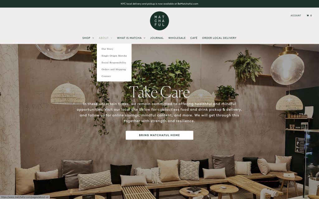 The folks at this Matcha retailer have an eye for style. Beautiful packaging and eye-catching product photos convey the product’s quality. The brand name brings spiritual and physical health to mind, and a physical location in New York works as evidence of the brand’s success, an avenue for acquisition, and a source of more imagery to use in their website and social media: it’s the perfect symbiotic relationship.
2. Sriracha2Go (Shopify)
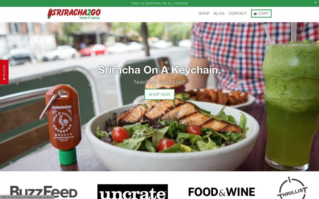 Sriracha2Go sells bottles so folks can take Sriracha with them to go. This brand is a perfect example of the KISS principle: Keep it simple, silly. Immediately upon opening their website, users are greeted with a perfect use case of their product, followed only by accolades that demonstrate that, yes, this is a great idea. If this doesn’t lead to conversion, probably nothing will.
3. Vena’s Fizz House (Shopify)
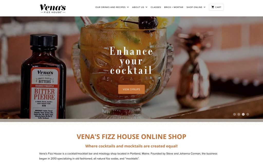 This online store takes some elements from other cocktail purveyors, with a key difference – The bright theme is in contrast to the typical dark shade, so it feels more like a store than a bar. The more cheery vibe effectively reflects the brand’s ethos – the products are suited for use both with or without alcohol.
4. Veestro (Shopify)
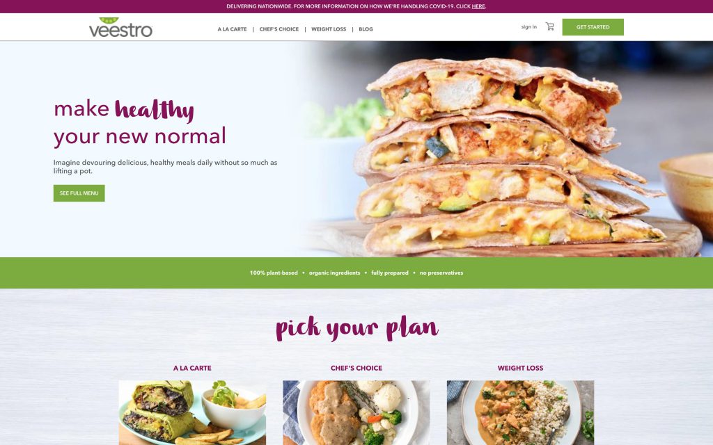 Human brains associate feelings about food strongly with color. This is why the example above, GOGO Curry, uses yellow: Yellow makes people hungry. On the other hand, reddish purple and green seem healthy, like red cabbage or zucchini. Veestro surely had this in mind with the color-forward design of their online store. Photography that fits in perfectly with these colors rounds out the design.
5. Island Creek Oysters (Shopify)
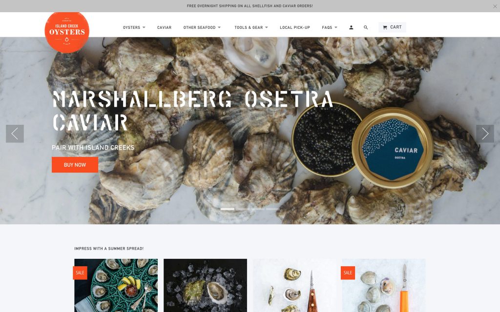 My first thought upon seeing this store was, “You can order oysters online?” But the site’s welcoming design and plentiful information make even a total novice like me feel like I could buy some oysters or caviar with confidence. This proactive approach surely pays dividends in acquisition outside of the typical consumer.
6. Haus (Shopify)
 Haus are American aperitif manufacturers. Stunning photography and a charitable attitude work well to make this brand approachable – which is necessary for a category as intimidating as the Aperitif. The brand’s website fits with their approach of reintroducing the beverage to the American market – opting for simple descriptions instead of confusing terminology.
7. Jeni’s Splendid Ice Creams
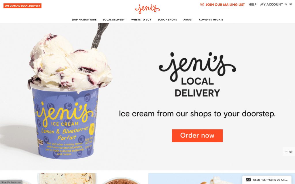 Anyone who’s had the pleasure to visit one of this ice creamery’s brick-and-mortar stores knows that there’s usually a line, and it’s totally worth the wait. On the cutting edge in terms of both products and everything else, Jeni’s even offers delivery for ice cream, previously a logistical impossibility. A simple, straightforward site design engenders trust in the product.
8. Silk Road Teas
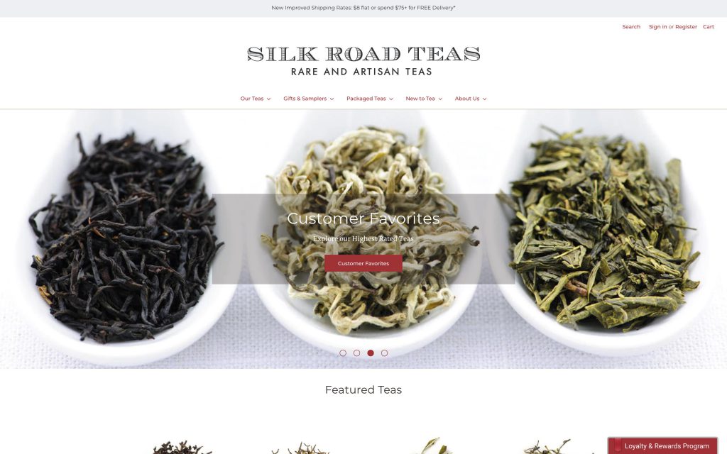 An accessible site design is key to acquiring customers from unreached markets. Silk Road Teas’ elegant site design includes a new-to-tea page prominently at the top of the page, which links to self-produced video content that is welcoming even to total beginners.
9. Boxed
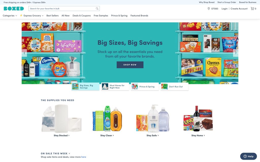 We love seeing an e-commerce platform take off based on a business model for which a brick-and-mortar location was originally considered indispensable. Boxed is a great example, providing an experience similar to warehouse clubs such as Costco. For price-conscious, delivery-savvy millennials, it’s a match made in heaven.
Japan
10. Go Go Curry (Shopify)
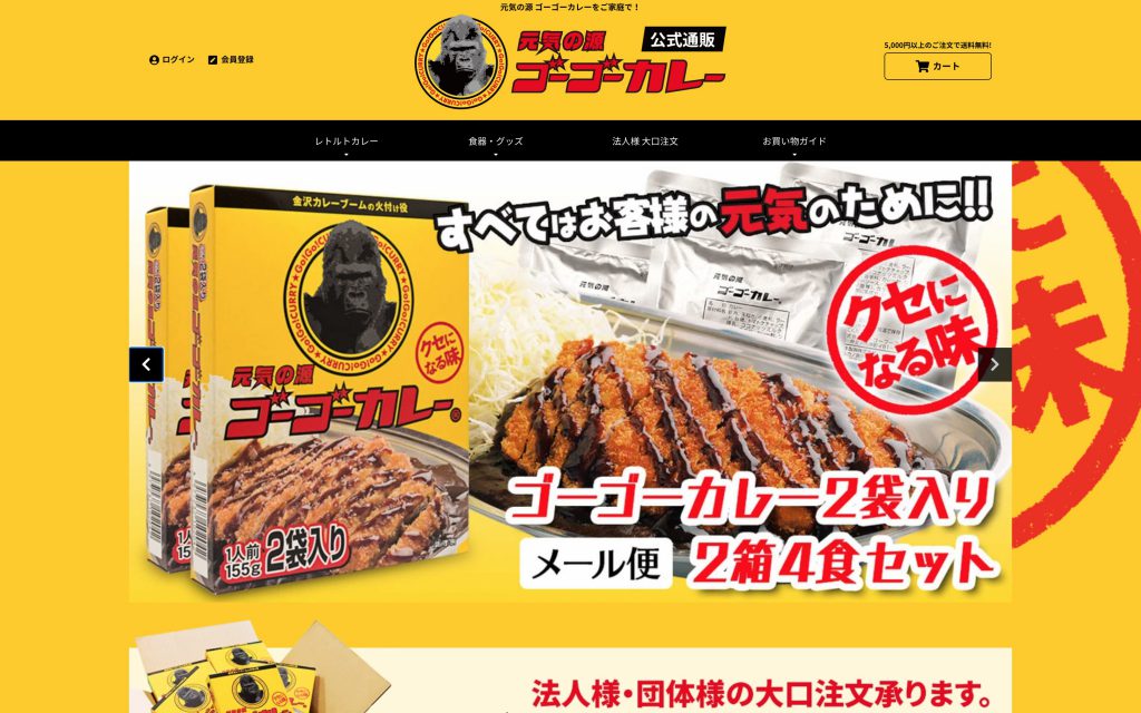 A household name in Japan, GOGO Curry’s restaurants can be found not just across the country, but also ever-increasingly in the USA. The one-of-a-kind flavor is also possible to enjoy at home with a roux mix, which is now available for purchase online. The website seamlessly integrates the existing brand imagery, for a browsing experience both impactful and welcoming.
11. Cowboy Craft (Shopify)
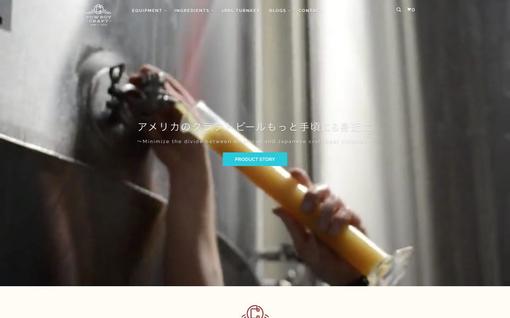 Japan’s craft beer scene, while burgeoning, lags behind the incredibly widespread and fast-growing American industry. Cowboy Craft hopes to change that, through importing of the tools and resources used in America. I love this marketing idea: a business-to-business sales model that supports the growth of the industry overall, therefore creating its own demand.
12. Base Food (Shopify)
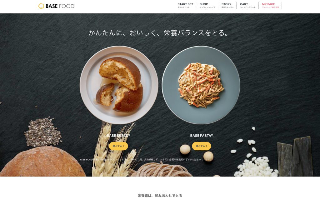 This product is best thought of in terms of what it seeks to replace: the Konbini meal. Japanese office workers are known to drop by the konbini, or convenience store, for a quick lunch or even dinner. With little free time during a busy work week, it’s an appealing option, but very difficult to ingest proper daily nutrients this way. In contrast, Base Bread or Base Pasta can also be prepared and eaten with little to no effort, but contains the nutrients necessary to replace a meal. An appealing product mission that targets a specific niche – smells like success.
Europe/UK
13. Heinz to Home (Shopify)
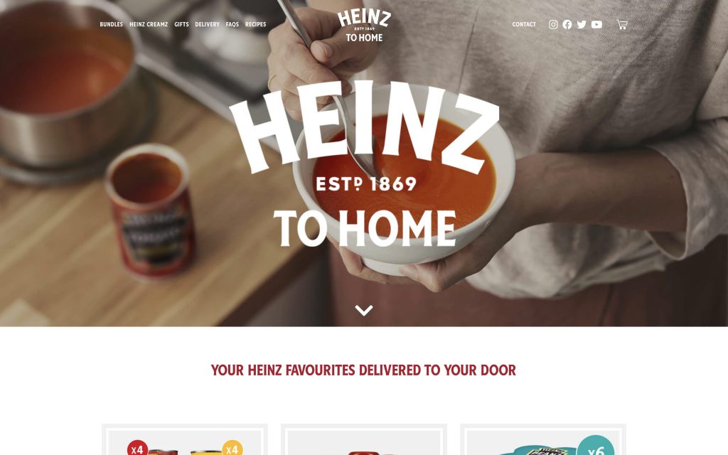 Beloved for ketchup in America, beans in the UK, and tomato sauces in Japan, Heinz is truly an international powerhouse of a brand. Even with 100 years of history, they continue to innovate with Heinz-to-home. By providing a product designed for life under the current pandemic, with free delivery for frontline workers, they exemplify the company’s values.
14. Planet Organic
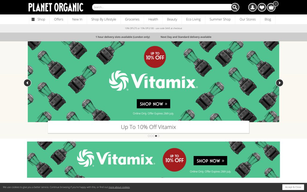 There’s nothing more satisfying than a brand name that perfectly encapsulates a company’s ethos, and Planet Organic is one such example. This one-stop-shop for ethical-minded consumers has thoughtfully included a shop-by-lifestyle feature, making a plastic-free, vegan, or otherwise alternative purchasing policy easier than ever.
15. Miso Tasty
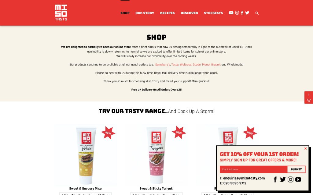 Japanese food sold abroad is typically associated with a small number of images, such as images of Mount Fuji, or old-fashioned brushstroke characters. Miso Tasty subverts these cliches with its brand imagery, which feels like it came from a a trendy Shibuya restaurant. This conscious branding helps it stand out from competition and establish itself as providing Japanese foodstuffs with an international twist.
16. Simply Chocolate
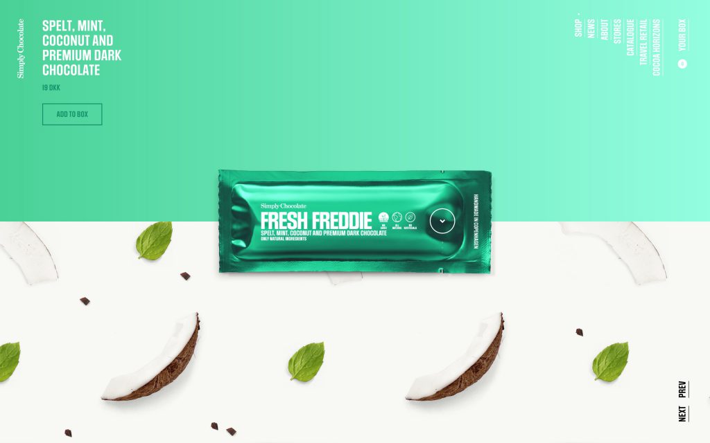 With behemoths such as Amazon able to provide a larger inventory than any competition, many e-commerce stores are looking in the opposite direction – deliberately providing a small, curated selection where customers don’t have to worry as much about choosing the perfect product. Simply chocolate exemplifies this theme with its website, which combines landing page, product page, and home page into one seamless shopping experience.
17. Crosstown Doughnuts
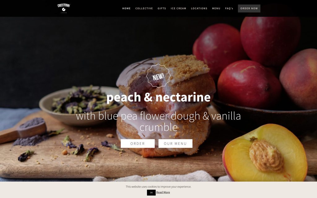 A highly visually appealing product skillfully photographed and an appealing color palette is a truly unbeatable combination, which Crosstown Doughnuts has mastered. Muted colors and shadows let the golden browns and pale shades of their desserts pop, proving that the typical white and pink palette of dessert branding isn’t the only way to grab customers’ attention.
18. Two Chimps Coffee
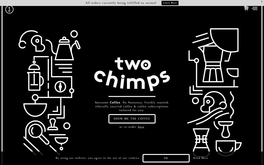 A typical business model for coffee involving e-commerce is, similar to aforementioned Matchaful, to keep both a visually appealing cafe and a web store. In this way, pictures from the cafe become material for the web store, and customers discover the cafe through the web-store. Two Chimps Coffee, lacking a physical storefront, had to think outside the box, but their dynamic webstore, both visually appealing and unique, doesn’t disappoint.
19. 6 O’Clock Gin
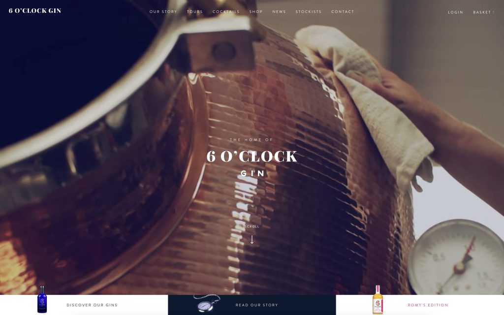 Between ever-increasing demand for fine whiskey, and a revolution in the image of the craft cocktail, the time is ripe for high-quality spirits to seek new markets. 6 O’Clock gin distinguishes itself with a combination of gorgeous images such as copper stills, and branding that is both informative and accessible.
20. Seedlip
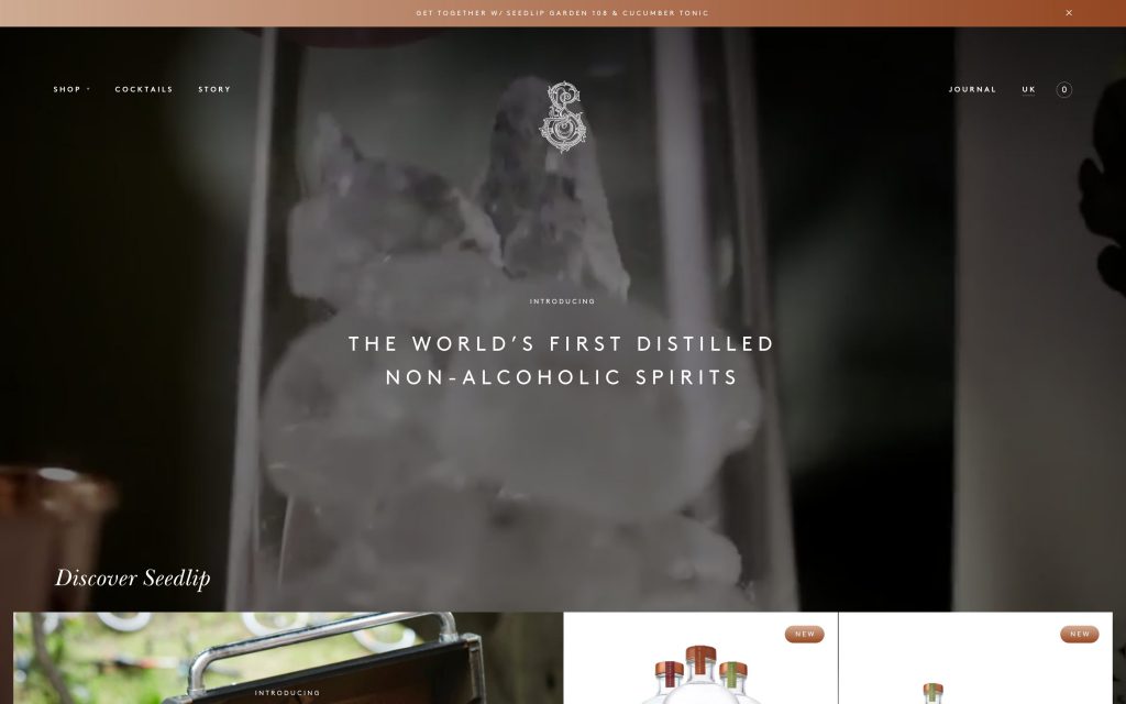 As mentioned above, demand definitely exists for high-quality spirits, but another undeniable trend in consumer behavior is demand for products that suit a particular lifestyle choice. Seedlip fills the niche at the intersection of these two movements, allowing even those who do not consume alcohol to enjoy a compelling craft cocktail, whether at home or a bar. Elegant branding reflects the natural ingredients of each product.
What did you think? It’s clear that e-commerce in the food industry is on the up-and-up. We at Go Ride, as certified Shopify Experts and digital marketing consultants, are excited to be a part of the movement. Please don’t hesitate to reach out to us with any inquiries about Shopify, digital marketing, social media management, and more! We’re your one-stop-shop for digital branding. Contact us here!




![[A must see for anyone considering expanding their site to the Japanese market] Essential functions for E-Commerce sites in Japan](https://news.goriderep.com/wordpress/wp-content/uploads/2020/01/essential-functions-for-e-commerce-sites-in-japan_main-300x200.jpg)

